SGF
Slovak gymnastics federation
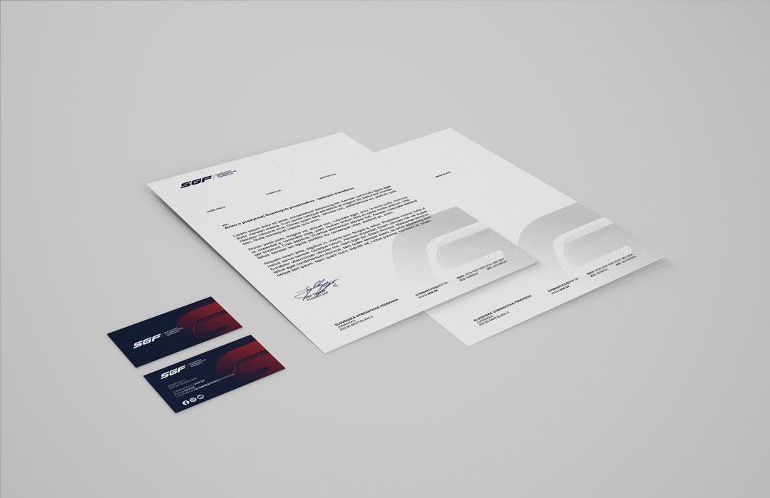
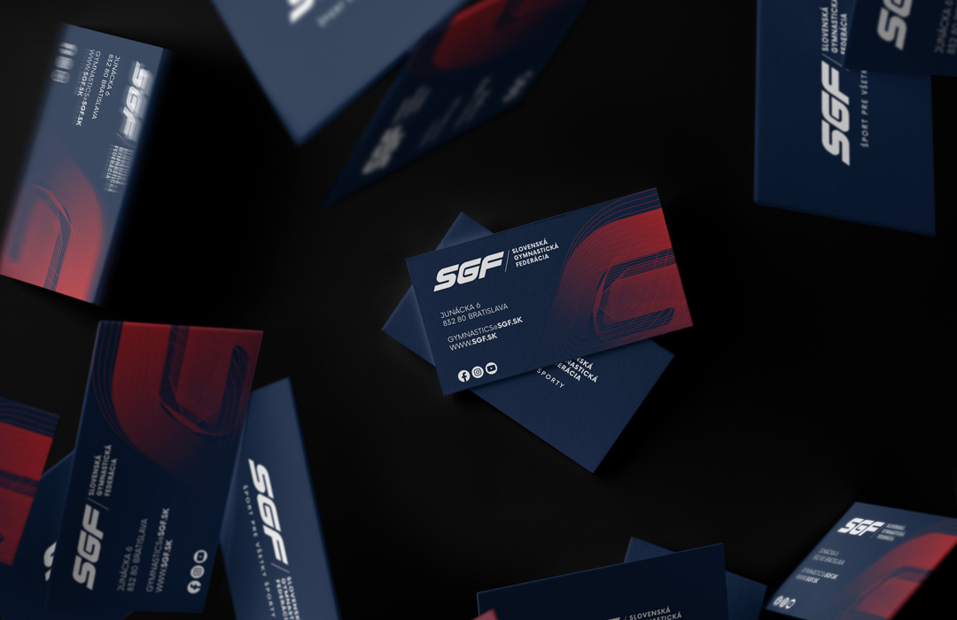
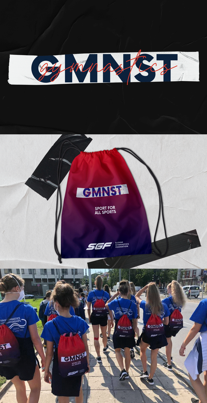
Slovak gymnastics federation approached us with help in creating a visual identity. After designing the new logotype, it was necessary to adapt the communication of the federation. In the beginning, several aspects had to be taken into account. From the operation of the brand, recognizability from the competition, its possibilities of communication, presentation.
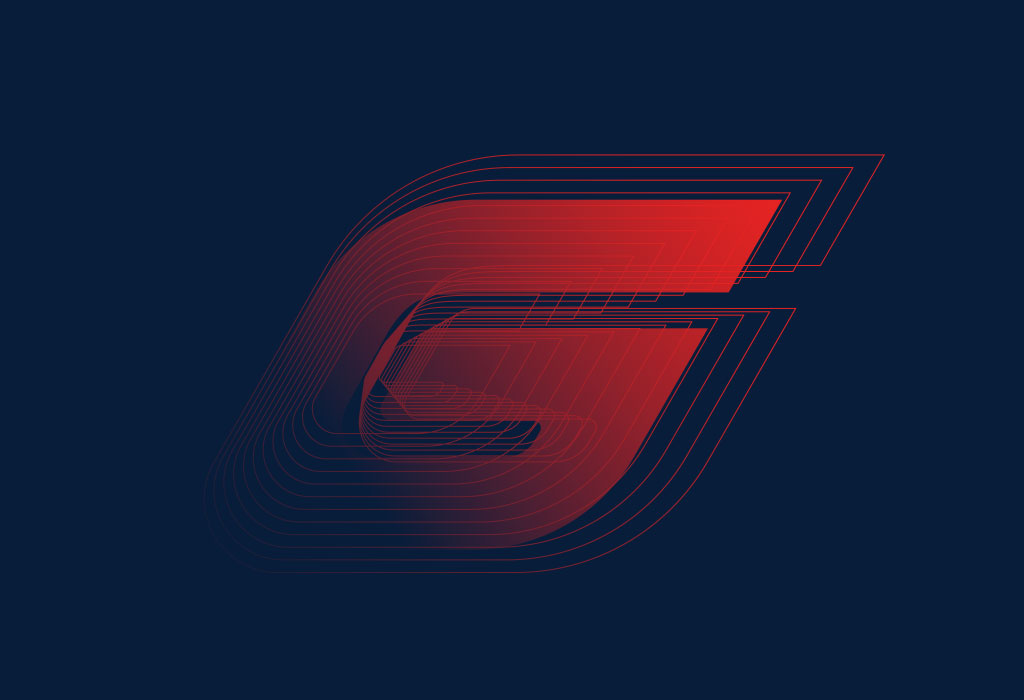
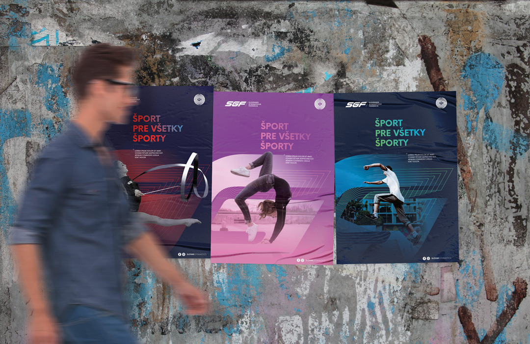
In the beginning, it was necessary to find the supporting element so that it was simple and functional. We found this element in the interpretation of the letter G, which is used in the SGF logotype. Element symbolizing the word gymnastics, universal in Slovak, but also in English as gymnastics. At the same time, with its structure and power, it creates a space for depicting the whole world of gymnastics.
A world where difficult trainings, competitions, performances, pain, joy take place. Everything you experience with gymnastics, which you have to devote to 200% if you want to be good.
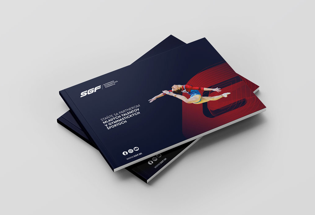
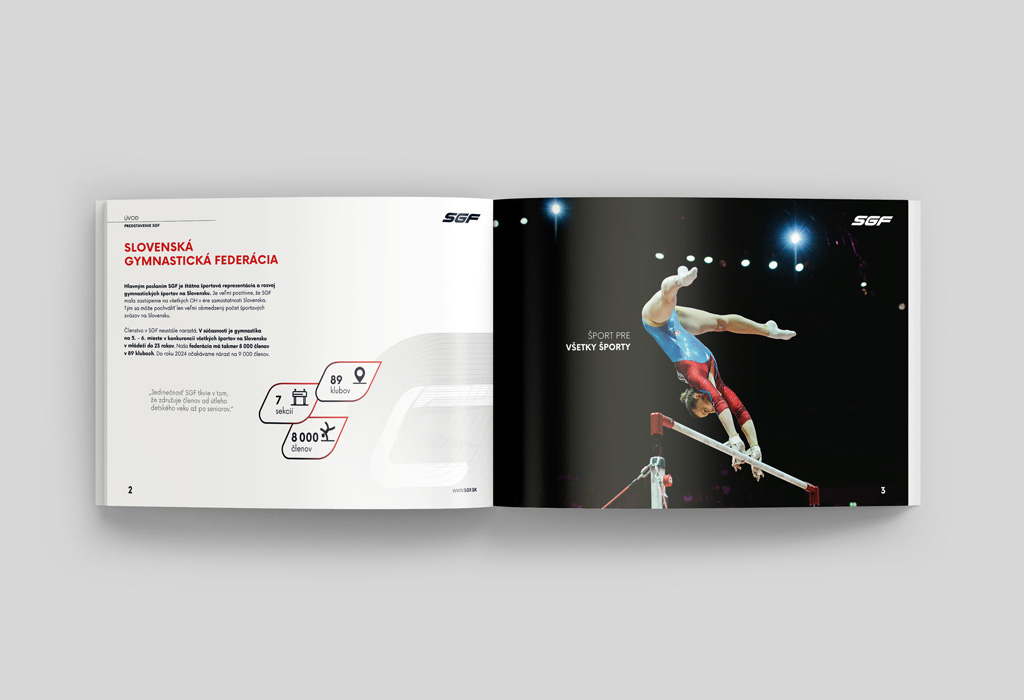
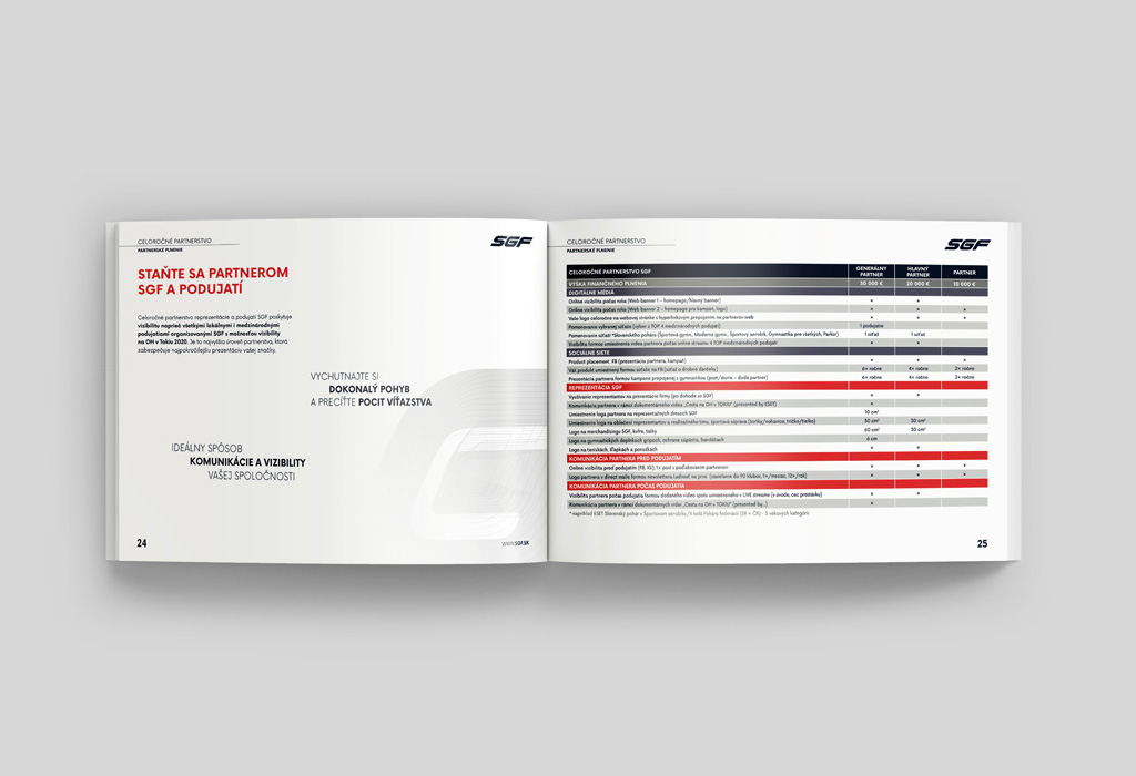
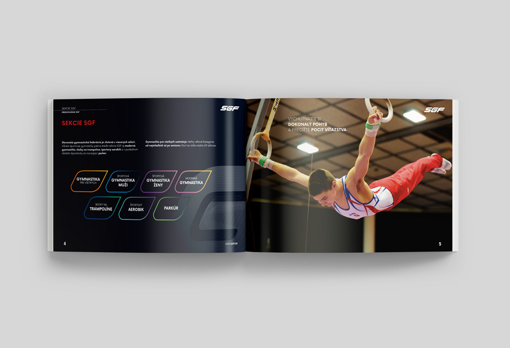
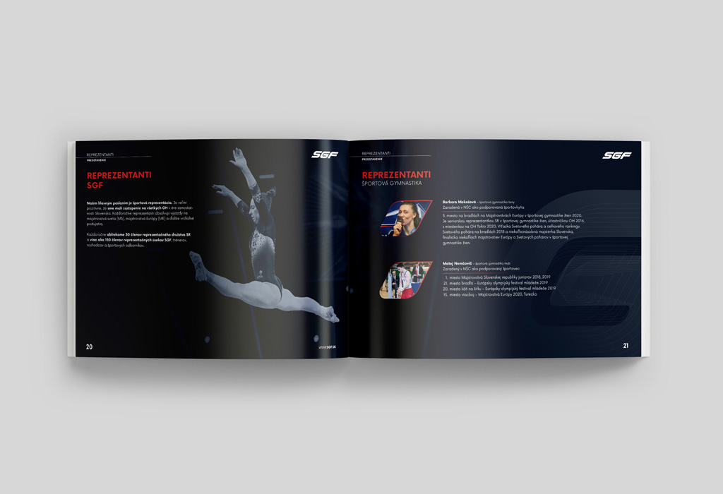
For the purpose of acquiring partners, we have prepared, in cooperation with SGF marketing, a partnership presentation with various attractive services for future partners.
The Slovak Gymnastics Federation purposefully builds and develops its sports family and its goal is long-term partnerships.
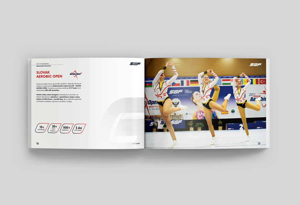
Linking SGF's partnership to events of international importance is an excellent investment in advertising and a marketing tool with an international reach. International events are watched not only by athletes and their fans, but also by spectators of sports online broadcasts.


