SHZ
Rebrand of the Slovak Handball Federation
Before the Men´s EHF EURO 2022, SHF defined the goal of preparing a redesign logotype designed by Jozef Ambruš in 1972. The task was to preserve the original logo but at the same time simplify it, make it more attractive.
We used the name of the association in the Slovak-English language, for better communication within the upcoming EHF EURO 2022. We simplified the color from the original 5 colors to 2, the basic dark blue and additional gray. We placed the logo in a circle to highlight its construction.
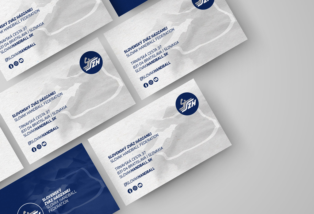
Along with the redesign of the logo, we prepared a new visual identity for federation,which included creating a design for various prints such as letterhead, business cards, envelopes, writing pad, folder, rollup, bacdrop walls, banners. Last but not least, it was necessary to unify the outputs for the online environment. We designed a powerpoint presentation, an email signature along with a basic social networking package.


In addition to the design of the SHF identity, we have prepared new communication guidelines for women and men national teams. They created a communication proposal for both offline and online environments.
The main motive is the individual players, which we gradually introduce. Each national team match has other players on the visuals.

